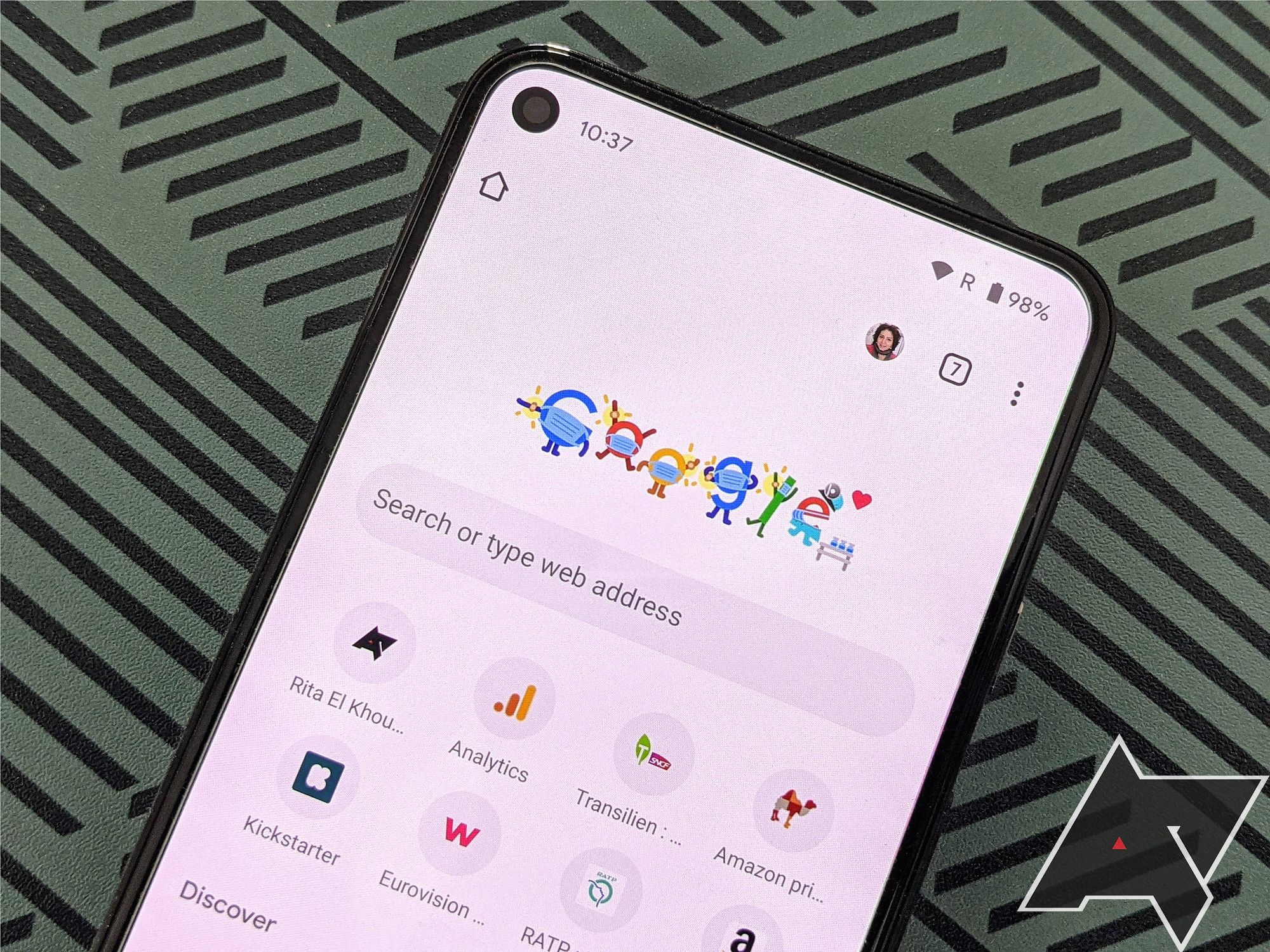
Google Chrome for Android has a snazzy new address bar in the works
Google Chrome for Android has a redesigned address bar and suggestions interface in the works. The new design will mostly only be visible when you tap the address bar, making the suggestions for it look more in line with how the Google Search app and the Pixel Launcher search looks like on the Pixel 6 and 6 Pro. It’s most likely that the redesign will roll out with or after the release of Chrome 108, which is currently in the Canary development stage, where it offers the best glimpse at the new design.
The redesign has been spotted by 9to5Google. On Chrome Canary, it can be enabled via the
chrome://flags/#omnibox-modernize-visual-update flag that aptly describes what the experiment is all about: “When enabled, Omnibox will show a new UI which is visually updated.” Omnibox here is the name Google uses to describe its combines address and search bar. While the flag is also available on the current stable release of Chrome, 105, it doesn’t change anything just yet here.
When enabled in Canary, you won’t see much of a difference when you visit a website or when you just look at the address bar. The visual change currently solely affects the screen that shows up when you tap the address bar. Here, search and URL suggestions now live in a box with rounded corners, with each suggestion highlighted in a small card of its own. The look resembles that of the Pixel launcher search or the Google Search app, so it goes a long way in making Android feel more consistent across default apps.
Interestingly enough, the flag description also mentions that “this flag is for step 1 in the Clank Omnibox revamp plan,” suggesting that Google is working on a bigger refresh of the omnibox. No further details were shared on this, though.
We hope that in the process of the redesign, Google will move the address bar to the bottom of the screen again, like it did with its Chrome Duet experiments a while back. With phones becoming increasingly bigger and introducing novel foldable form factors, reachability at the top of the screen just isn’t a given. Other browsers, like Firefox or Brave, have already embraced this design principle, and Apple has started enabling a bottom-centered interface for Safari on iOS by default.
( Details and picture courtesy from Source, the content is auto-generated from RSS feed.)
Join our official telegram channel for free latest updates and follow us on Google News here.


