Nothing phone (1) in for review
We have to hand it to Nothing and its CEO, they created a lot of hype for the Nothing phone (1). We're sure having someone like Casey Neistat as an investor doesn't exactly hurt either. But it worked, the Nothing phone (1) is all everyone seems to be talking about, it's been a feature in our most-read stories since it was first teased, and its specs page is topping our daily interest charts for a while now - great start.
But now the phone is shipping hands, and in our office to undergo our review process, it's time to look at past the hype and see what the Nothing phone (1) really is about. Let's start with an unboxing.
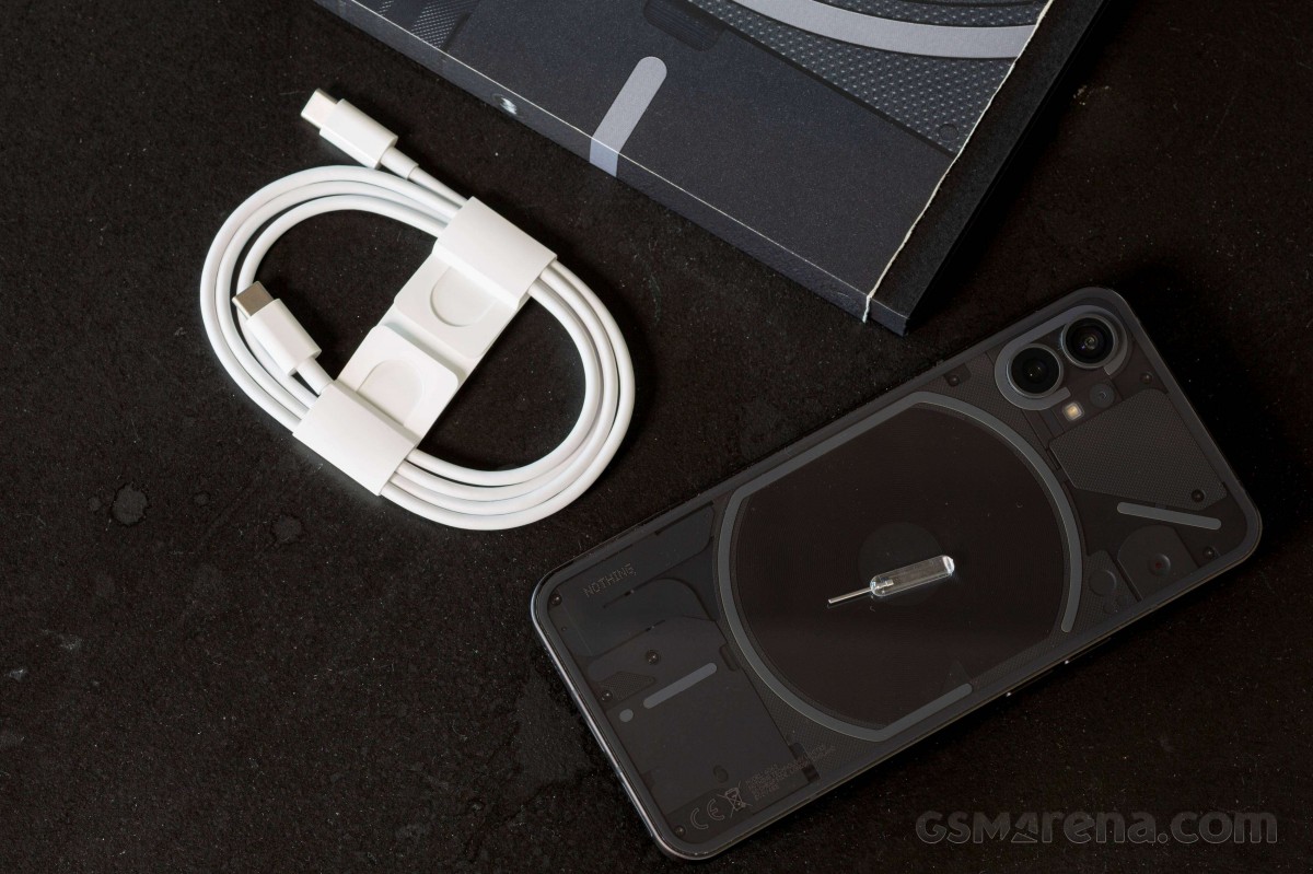
The box is made of cardboard but is appealing and different. It looks more like a CD boxset than a phone package.
Inside there's the phone - you can have a White or a Black one, a USB-C to USB-C cable, and a SIM tool that reminds us of a fuse. There's no case, nor a charger. Nothing sells both of these items as well as a screen protector on its website. Mind you, the phone does feature a pre-applied plastic screen protector from the box.
Forgoing the extras helped keep the price reasonable, although we wouldn't call it supper low. The 8/128GB base Nothing phone (1) costs Euro469/GBP399, while a move up to 8/256GB is Euro499/GBP449.

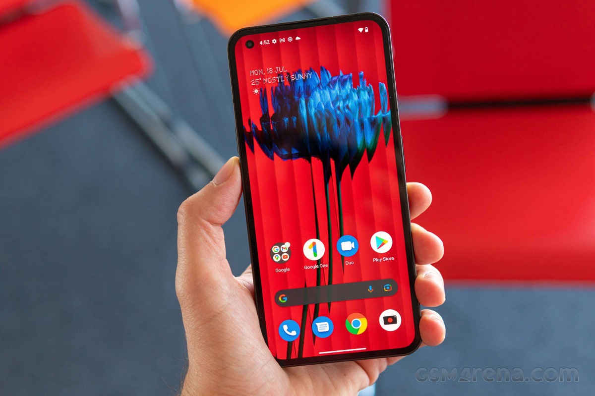
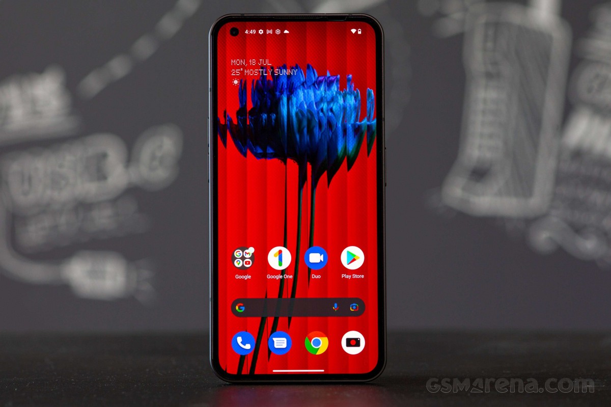
The Nothing phone (1) looks like most phones from the front, but that's more a limitation of the current tech than of the phone. It has a 6.55-inch OLED of 120Hz refresh rate, which feels just right size-wise.
The phone is almost entirely void of curves. The front and rear glass are both flat and the matte aluminum sides are also flat. It makes the phone (1) more than a little bit like an iPhone 13. Although its size puts it in line to strike blows with an iPhone 13 Pro Max the two are priced very differently so they are unlikely to cross paths.

A word on in-hand characteristics and performance - the Nothing phone (1) feels light, lighter than its 194g weight would suggest. And performance is stellar. The Nothing launcher makes this phone feel similar to a Pixel and that's a compliment.

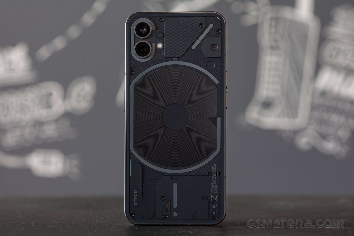
The back of the Nothing phone (1) is obviously its standout part. It's what's in every promo, and what you'll see on Nothing's website. There are two reasons for this - the striking transparent design, which isn't fake either - you actually see parts of the phone. The other reason are the LED lights - Nothing calls these the Glyph. Per Wikipedia that means "any kind of purposeful mark, such as a simple vertical line incised on a building, a single letter in a script, or a carved symbol."
The LED strips are noticeable even when not lit. Each strip can light up independently. They light up when you receive a notification or a call, but can also be used as a fill light for selfies or videos. Nothing has made some techy notification and call sounds that synchronize with different parts of the glyph interface. It's really cool even if it's usefulness is questionable.

The Nothing phone (1) looks like an interesting option for a lot of people. It has solid hardware and an interesting look and feel in a see of boring mid-rangers. But you might want to wait for our full review before pulling the trigger. There are a lot of things to evaluate - battery life, camera quality, performance, especially under load. Keep watching this space!
( Details and picture courtesy Source , the content is auto-generated from the RSS feed.)
Join our official telegram channel for free latest updates and follow us on Google News here.


