Android Auto streamlines its media player, just in time for your next road trip sing-along
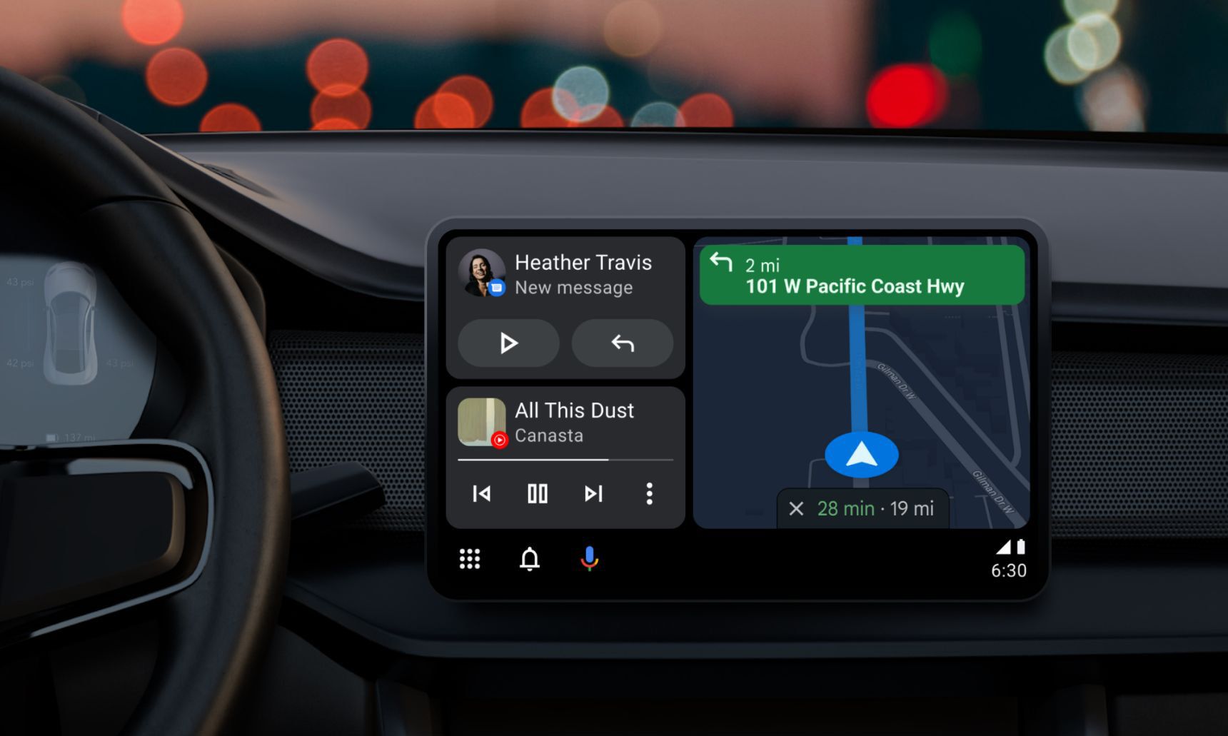
Google promised its redesigned UI for Android Auto would arrive just in time for the summer driving season. Nearly a month into the hottest time of the year, we still haven't seen it arrive in cars yet. That's not to say Google isn't ready to roll out some changes to its car-friendly interface. While it might not be the split screen mode everyone is waiting for, Android Auto's media player is getting a refreshed look, bringing a much-needed dose of modern design and bug fixes to your vehicle.
Although Android is usually a space filled with various alternative layouts for apps depending on what you download from the Play Store — Spotify, YouTube Music, and Apple Music all have very different looks, even as they accomplish the same task — Auto doesn't fall into the same category. Google keeps supported media players looking the same across the board, and there's a good reason for that. Getting distracted as you hunt and peck for the play button in a new app is a lot more dangerous on the road than it is while you're falling asleep in bed, so no matter which streaming service you're subscribed to, Android Auto keeps everything consistent.
Android Auto's media player, as it appears in v7.7.6221.That said, the current player has some serious bugs — most notably an issue with the backdrop on wide car displays. In Android Auto, the media player uses a blurred version of the album art for your desired song as a background. In theory, this looks great, but until now, album artwork has only appeared across a portion of the display. In my experience, it's not incredibly noticeable from the driver's seat — the artwork is on your side, after all — but the second you see it, it's hard to ignore.
Thankfully, Android Auto's latest update fixes this problem. Some eagle-eyed Redditors noticed that Auto v7.8.6225 fixes this issue altogether, something I can verify in my own vehicle (via 9to5Google). While my background was improperly positioned in v7.7.6221, an update from the Play Store took care of everything.
Android Auto beta v7.9.1228, feature improved backgrounds and a new playback bar.It's not the only change Google is introducing, however. Android Auto beta v7.9.1228 ditches the circular playback bar wrapped around the pause icon for something far more traditional. The playback bar now appears as a white line stretching across the display, something that — in my limited testing — sure seems a lot easier to notice while driving.
Neither of these changes are monumental, especially since you should keep your eyes on the road, not on whether "Free Bird" is almost over yet. Still, it shows Google's commitment to cleaning up Android Auto, making it feel modern and elegant while also reducing and restricting distractions as much as possible. With the competition in the automotive space heating up, staying ahead of the competition through design, features, and third-party apps is a must.
( Details and picture courtesy from Source, the content is auto-generated from RSS feed.)
Join our official telegram channel for free latest updates and follow us on Google News here.


