Samsung tells the story behind the design of the Galaxy S22 series
If you ever wondered what the story behind the design of Samsung's latest and greatest flagships was, this is for you. That is, if you like reading PR speak gibberish in your spare time, as we do. If so, you'll be enticed by phrases like "the essence of originality" and "newness beyond innovation".
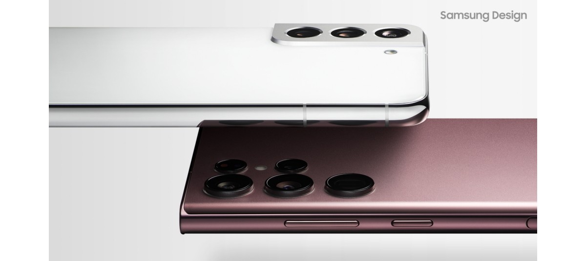
The Samsung marketing team is basically praising the Samsung design team in terms that lowly humans who don't work in marketing departments may have trouble understanding very well. Here's what "the essence of originality" is all about: "Samsung has always aspired to develop a simple and flat form that harmonizes technology and design without exposing the boundary between them. With smooth, beautiful lines that resemble the curvature of sand dunes, moderation and solidity coexist in the Galaxy S series' simplified form".

So, yeah, that. What about "bold geometry"? Well, in case you weren't aware, the "design philosophy prioritizes capturing only the most essential elements in order to establish a unique identity". Unique but different between the S22/S22+ and the S22 Ultra, no?
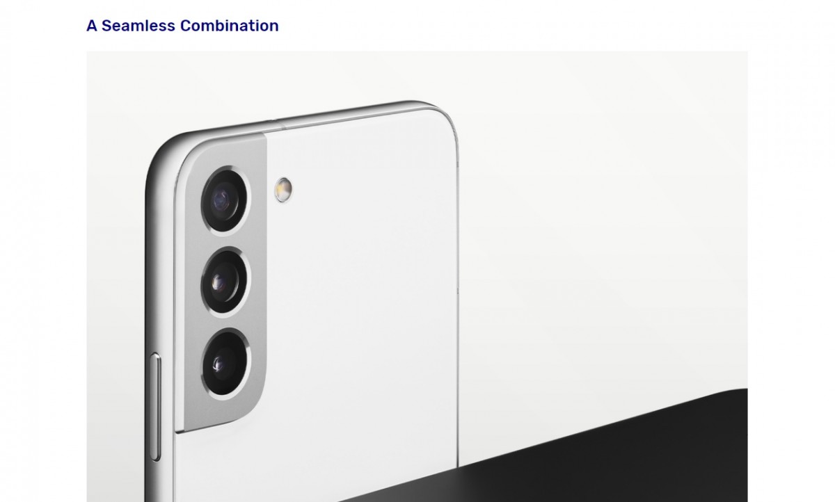
Perhaps the best part is where the words "a seamless combination" are directly followed by an image showing a Galaxy S22 or S22+, with the new seam separating the camera island from the frame, unlike what we saw in last year's truly seamless design for the S21 family members. That's hilarious, but the point Samsung is trying to make isn't about that, instead the seamlessness is about colors: "The Galaxy S22 and S22+ both feature analogous colors in their metal camera housings and bodies, creating a sense of unity". Sure, okay.

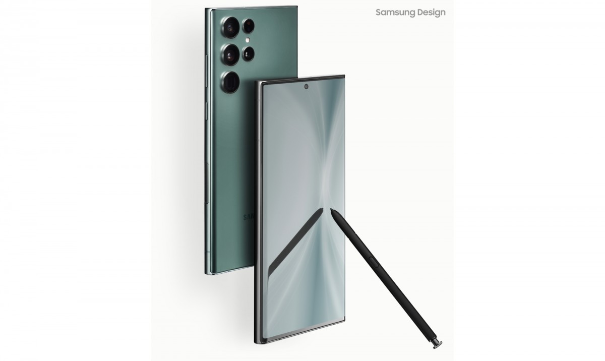
The section talking about the S22 Ultra's design doesn't try to hide that it inherited the Galaxy Note series' "simple yet sturdy design identity". It also describes how the company "minimized the camera's size by optimizing its design". There's also some info about the S Pen being a joy to use, owing to its lower latency, as well as some new features in One UI - because "design" can mean software design too.

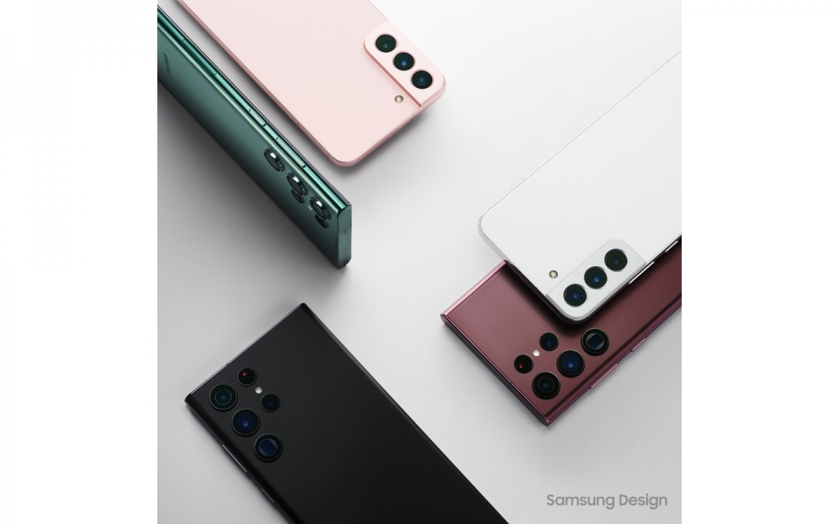
Even Samsung Wallet gets a shout-out, before we move on to colors and how they're trendy yet classy. And if you need even more colors in your life, guess what? Samsung has cases to sell you. Obviously it can't put even a simple one in the box with the phone, because it's all in with the environment now. No case, no charger - why not pay for those separately and get them in separate packaging that overall is more wasteful? Right? But hey, at least the S22's box is 56% smaller by volume than that of the S20.

Finally, Samsung excitedly promises that "going forward, the company will continue to create innovative experiences that reflect our changing times, break existing boundaries and transcend the limits of what smartphones can do".
We've only given you some excerpts, but the entire "Design Story" is waiting to impress you at the Source linked below. And if you're interested in Samsung's new flagships, check out our hands-on review of them.
( Details and picture courtesy GArena, the content is auto-generated from the news agency feed.)


